機械学習入門チュートリアルscikit-learnで手書き数字学習と認識
前の記事はscikit-learnのワインのデータを確認したりして、scikitの基本を少し理解していただけましたでしょうか?
書きました!
年末年始、何をやろうかなとまだ決めていない人は、この記事を読んでくれ!そして機械学習を勉強してくれ!日本の人工知能業界を盛り上げてくれ!https://t.co/grtHwRhrjR
— 川島@ソフトウェア、Web、アプリ、IoT作るのが大好き (@kokensha_tech) 2018年12月25日
今回は、手書きの数字の画像データをそのものを特徴量として学習させて、どのぐらいの正確率で認識する機械学習を体験してもらいたいと思います。
このチュートリアルで期待できる学習結果
- scikit-learnの手書き数字のデータセットを知ります。
- 学習の方法を理解します。
- 画像データの学習のイメージを持ちます。
PCでPythonの環境を構築して、Jupyter Notebookで下記のプログラムを実行するには下記の記事を参考してください。
目次
まずデータに慣れましょう
今回の記事の対象データは、手書き数字の画像データです。
つまり、8×8の画像です。全部で64ピクセルです。64の特徴量があるわけです。64次元のデータとも言います。
早速、その64ピクセルを見てみましょう。
(このチュートリアルもGoogle ColabかJupyter Notebookでコピペで実行できます。)
# 必要なパッケージを導入します
from sklearn import datasets
データを導入しますた。
# digitsというデータセットをロードします。
digits = datasets.load_digits()
データを表示してみましょう
print(digits.data)
print('次元:',digits.data.ndim)
こんな出力になります。
[[ 0.  0.  5. ...  0.  0.  0.]
 [ 0.  0.  0. ... 10.  0.  0.]
 [ 0.  0.  0. ... 16.  9.  0.]
 ...
 [ 0.  0.  1. ...  6.  0.  0.]
 [ 0.  0.  2. ... 12.  0.  0.]
 [ 0.  0. 10. ... 12.  1.  0.]]
次元: 2
print(digits.target)
出力:
[0 1 2 … 8 9 8]
これは、数字のラベルですね。つまり、それぞれの画像が数字の1なのか、2なのかのラベルですね。教師ラベルのことですね。
試しに、三番目のデータを取り出してみましょう
digits.images[2]
array([[ 0.,  0.,  0.,  4., 15., 12.,  0.,  0.],
       [ 0.,  0.,  3., 16., 15., 14.,  0.,  0.],
       [ 0.,  0.,  8., 13.,  8., 16.,  0.,  0.],
       [ 0.,  0.,  1.,  6., 15., 11.,  0.,  0.],
       [ 0.,  1.,  8., 13., 15.,  1.,  0.,  0.],
       [ 0.,  9., 16., 16.,  5.,  0.,  0.,  0.],
       [ 0.,  3., 13., 16., 16., 11.,  5.,  0.],
       [ 0.,  0.,  0.,  3., 11., 16.,  9.,  0.]])
これは、一つの数字の画像ですね。
# 必要なパッケージを導入します
from sklearn import datasets
import matplotlib.pyplot as plt
データを画像として描画してみましょう
画像として使うときは matplotlib.pyplot.imreadを使います。
#一番目の数字を表示する
plt.imshow(digits.images[-1], cmap=plt.cm.gray_r, interpolation='nearest')
plt.show()
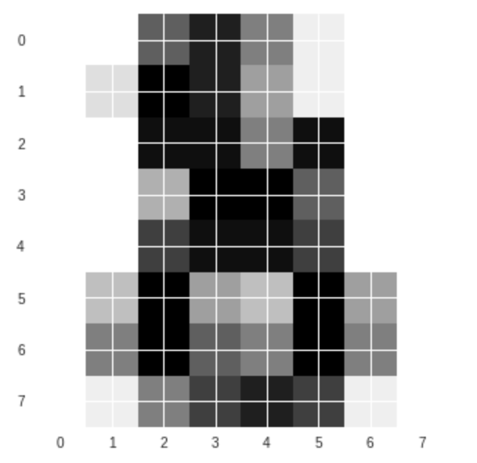
何に見えますか?なとなく「8」かな。少し分かりづらいですね。人間にとっても画像を見て「分類」タスクをする時に、難しい場面がありますね。
もう一つ別の数字を描画してみましょう。
#例えば31番(配列の要素は0から数えますので、31番目は30で取り出します。)

plt.imshow(digits.images[30], cmap=plt.cm.gray_r, interpolation='nearest')
plt.show()
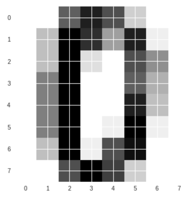
今度は、interplotionを変えてみましょう。
#任意の数字を表示する(例えば48番)
plt.imshow(digits.images[47], cmap=plt.cm.gray_r, interpolation='bicubic')
plt.show()
こちらは数字の1ですね。
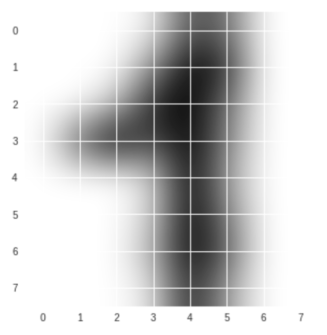
cmap(color map)で遊びましょう
ちょっと色をつけてみましょう。
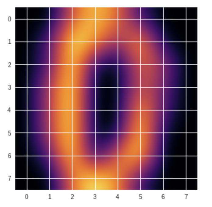
#cmapを変えてみよう plasma
plt.imshow(digits.images[47], cmap='plasma', interpolation='bicubic')
plt.show()
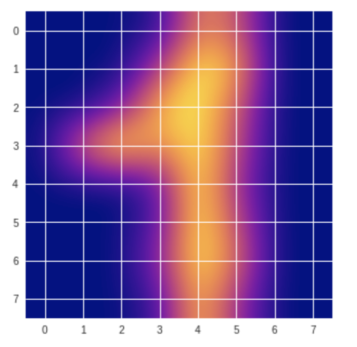
#cmapを変えてみよう inferno
plt.imshow(digits.images[30], cmap='inferno', interpolation='bicubic')
plt.show()
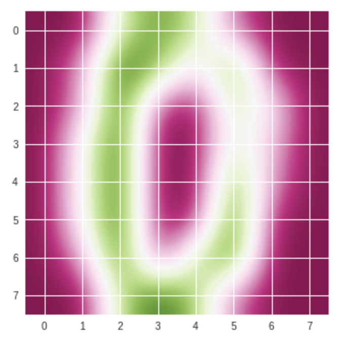
#cmapを変えてみよう PiYG
plt.imshow(digits.images[30], cmap='PiYG', interpolation='bicubic')
plt.show()
#cmapを変えてみよう viridis
plt.imshow(digits.images[30], cmap='viridis', interpolation='bicubic')
plt.show()
いろんな色の表現がありますね。
複数データを描画してみましょう
# 必要なパッケージを導入します
import numpy as np
#数字を表示する
#行
rows_count = 4
#列
columns_count = 4
#
graphs_count = rows_count * columns_count
# axesオブジェクト保持用
axes = []
# x軸データ
x = np.linspace(-1, 1, 10)

# figureオブジェクト作成サイズを決めます
fig = plt.figure(figsize=(12,9))

#
for i in range(1, graphs_count + 1):
   # 順序i番目のAxes追加
    axes.append(fig.add_subplot(rows_count, columns_count, i))
     # y軸データ(n次式)
    y = x ** i
    axes[i-1].imshow(digits.images[i],interpolation='bicubic', cmap='viridis')

# グラフ間の横とたての隙間の調整
fig.subplots_adjust(wspace=0.3, hspace=0.3)
plt.show()
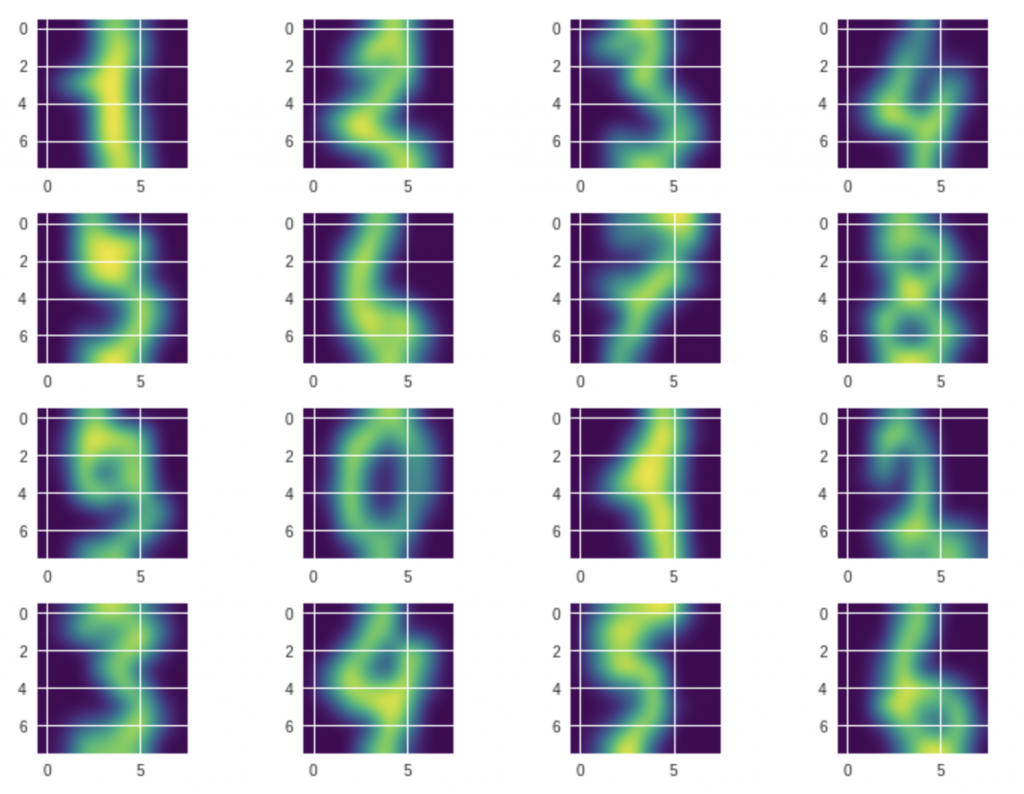
このデータセットにはこういう手書きの数字で構成されていますね、はっきり確認できました。
このような数字データは全部で1797個があります。
各数字にそれぞれ約180個の画像データがあります。
次はこの1797個のデータを全部一気に三次元の空間に表示してみましょう。何が見えるかな。
手書き数字データセットを三次元の空間でみてみましょう
# 必要なパッケージを導入します
from sklearn import decomposition
from mpl_toolkits.mplot3d import Axes3D

# 手書き数字のデータをロードし、変数digitsに格納
digits = datasets.load_digits()

# 特徴量のセットを変数Xに、ターゲットを変数yに格納
all_features = digits.data
teacher_labels = digits.target
次は(0-9)数字データの色を指定する関数です。
def getcolor(c):
    if c==0:
        return 'red'
    elif c==1:
        return 'orange'
    elif c==2:
        return 'yellow'
    elif c==3:
        return 'greenyellow'
    elif c==4:
        return 'green'
    elif c==5:
        return 'cyan'
    elif c==6:
        return 'blue'
    elif c==7:
        return 'navy'
    elif c==8:
        return 'purple'
    else:
        return 'black'
64個の特徴量もありますので、ちょっと多いです。
ここで次元削減する必要が出てきます。
ここでは、scikit-learnで実装されているPCAを使って次元削減を行います。
# 主成分分析を行って、3次元へと次元を減らします
pca = decomposition.PCA(n_components=3)

# 主成分分析により、64次元のXを3次元のXrに変換
three_features = pca.fit_transform(all_features)
作図して、描画します。
# figureオブジェクト作成サイズを決めます
fig = plt.figure(figsize=(12,9))
#
ax = fig.add_subplot(111,projection='3d')
# 教師データ(teacher_labels)に対応する色のリストを用意
colors = list(map(getcolor, teacher_labels))

# 三次元空間へのデータの色付き描画を行う
ax.scatter(three_features[:,0], three_features[:,1], three_features[:,2], color=colors)

# 描画したグラフを表示
plt.show()
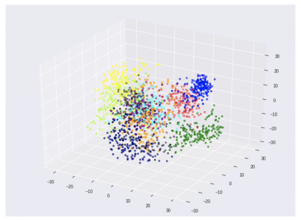
何となく、手書き数字のデータがそれぞれ、三次元の空間に固まっている事が視覚的に分かりますね。
MNIST手書き数字の三次元表現
綺麗に固まっていますね。
重なっているところは
判定しにくいところですね。 pic.twitter.com/mtNZi8ePf0— 深層学習・Python・機械学習、Web、IoT (@kokensha_tech) 2019年2月14日
それぞれのグラフ上の塊がそれぞれの手書きの数字です。
それの「三次元空間上」の特徴(学習済モデル)を把握すれば、新しい手書きの数字が来ても、その特徴(学習済モデル)を利用して、推論、判別ができます。
いよいよ学習させましょう
三次元の空間に、SVMアルゴリズムを使って、それぞれの数字の塊を分ける「超平面」を見つけることで学習させます。
分類機を導入してみましょう
#分類機(Classifiers) SVMとmetricsを導入します。
from sklearn import svm, metrics
# 画像ファイルは同じサイズでなければいけません。
images_and_labels = list(zip(digits.images, digits.target))
print('教師データ:',digits.target)
教師データ: [0 1 2 … 8 9 8]
# figureオブジェクト作成サイズを決めます
fig = plt.figure(figsize=(12,9))
#
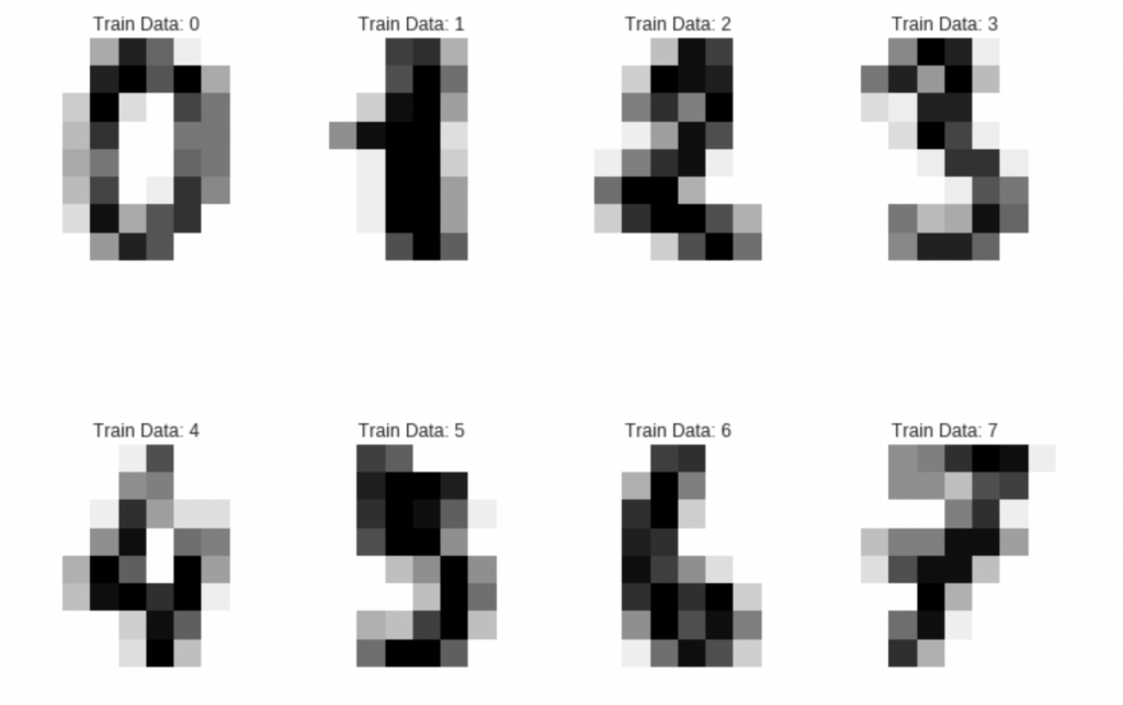
for index, (image, label) in enumerate(images_and_labels[:8]):
plt.subplot(2, 4, index + 1)
# 座標軸を表示しない
plt.axis('off')
plt.imshow(image, cmap=plt.cm.gray_r, interpolation='nearest')
plt.title('Train Data: %i' % label)
データの平均化
# データの個数
num_samples = len(digits.images)
print(num_samples)
データを再構成
data = digits.images.reshape((num_samples, -1))
# 必要なパッケージを導入します
import sklearn.svm as svm
SVM作成
分類機を作成します。SVCは support vector classifier の略です。
model = svm.SVC(gamma=0.001)
学習データと検証データを分ける
# 学習用の学習データと教師データ
train_features=data[:num_samples // 2]
train_teacher_labels=digits.target[:num_samples // 2]
# 検証用の学習データと教師データ
test_feature=data[num_samples // 2:]
test_teacher_labels=digits.target[num_samples // 2:]
# 最初の半分のデータを学習データとして、学習させます。
model.fit(train_features,train_teacher_labels)
# 残り半分のデータセットはテスト(評価)データとして使います。
expected = test_teacher_labels
#
predicted = model.predict(test_feature)
# 必要なパッケージを導入します
from sklearn.metrics import confusion_matrix
from sklearn.metrics import classification_report
print("分類機からの分類結果 %s: \n %s \n"
      % (model, classification_report(expected, predicted)))
print("コンフュージョンマトリックス:\n %s" % confusion_matrix(expected, predicted))
この結果が出力されます:
分類機からの分類結果 SVC(C=1.0, cache_size=200, class_weight=None, coef0=0.0,
  decision_function_shape='ovr', degree=3, gamma=0.001, kernel='rbf',
  max_iter=-1, probability=False, random_state=None, shrinking=True,
  tol=0.001, verbose=False):
               precision    recall  f1-score   support

           0       1.00      0.99      0.99        88
           1       0.99      0.97      0.98        91
           2       0.99      0.99      0.99        86
           3       0.98      0.87      0.92        91
           4       0.99      0.96      0.97        92
           5       0.95      0.97      0.96        91
           6       0.99      0.99      0.99        91
           7       0.96      0.99      0.97        89
           8       0.94      1.00      0.97        88
           9       0.93      0.98      0.95        92

   micro avg       0.97      0.97      0.97       899
   macro avg       0.97      0.97      0.97       899
weighted avg       0.97      0.97      0.97       899
コンフュージョンマトリックス:
 [[87  0  0  0  1  0  0  0  0  0]
 [ 0 88  1  0  0  0  0  0  1  1]
 [ 0  0 85  1  0  0  0  0  0  0]
 [ 0  0  0 79  0  3  0  4  5  0]
 [ 0  0  0  0 88  0  0  0  0  4]
 [ 0  0  0  0  0 88  1  0  0  2]
 [ 0  1  0  0  0  0 90  0  0  0]
 [ 0  0  0  0  0  1  0 88  0  0]
 [ 0  0  0  0  0  0  0  0 88  0]
 [ 0  0  0  1  0  1  0  0  0 90]]
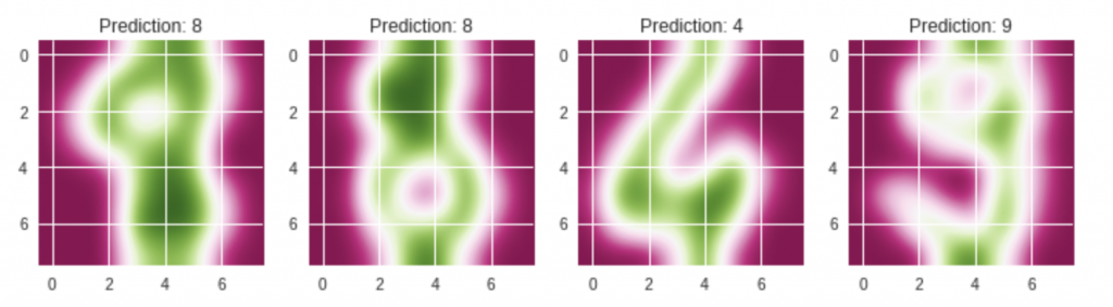
最後予テストデータを表示します。
# figureオブジェクト作成サイズを決めます
fig = plt.figure(figsize=(12,9))
#
images_and_predictions = list(zip(digits.images[num_samples // 2:], predicted))
for index, (image, prediction) in enumerate(images_and_predictions[:4]):
    plt.subplot(2, 4, index + 5)
    plt.imshow(image, cmap='PiYG', interpolation='bicubic')
    plt.title('Prediction: %i' % prediction)

plt.show()
まとめ
いかがでしょうか?
この記事では、sciki-leanのデータセットを使って、手書きの数字の機械学習とその検証をやりましたね。
scikit-learnの実装された機能を作って、「分類(Classfication)」を簡単に実施できるという事を実感していただけたでしょうか。
[amazonjs asin=”4873117984″ locale=”JP” title=”Pythonではじめる機械学習 ―scikit-learnで学ぶ特徴量エンジニアリングと機械学習の基礎”]
[amazonjs asin=”4873117585″ locale=”JP” title=”ゼロから作るDeep Learning ―Pythonで学ぶディープラーニングの理論と実装”]